---
title: "v3.0.0"
description: "Release notes for Nuxt OG Image v3."
canonical_url: "https://nuxtseo.com/docs/og-image/v5/releases/v3"
last_updated: "2026-07-27T12:59:51.224Z"
---
## Background
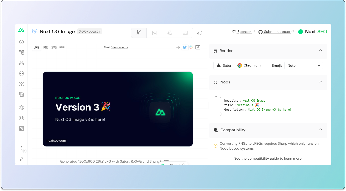
I'm excited to share the v3 of Nuxt OG Image is here!
This releases features:
- A complete rewrite of the module to improve stability and developer experience.
- Many new performance improvements, including a Zero Runtime mode.
- A new Playground with more features and community templates.
## 🚀 Features
### ✨ Zero Runtime Mode
Previously when using Nuxt as a server-side app with prerendered OG Images, you were forced to have runtime OG images as well which added
significant overhead to the server build.
In v3 there's a Zero Runtime Mode which will strip all tree-shakable OG image generation code from the final build, reducing
the size of the server bundle by 1.2mb and node_modules by 23mb.
See the [Zero Runtime Mode](/docs/og-image/guides/zero-runtime) guide for more information.
### ⛹️ Play Time: New Playground
The playground has been redesigned with a focus on giving you more ways to preview and debug your templates. It introduces
a number of tabs:
- **Design**
The default design view, this is the similar to v2 playground. It gives you HMR of the template, the ability
to change the options used to render the template.
New features include a social media previews (Twitter, Slack), changing
the rendering (Chromium, Satori) and more.
- **Templates**
See and preview all the OG templates available to you. You can select a template
to switch to it.
This also introduces "Community Templates", which are templates designed by the community, accessible to you. There are
7 community templates so far and more to come. Feel free to submit your own!
- **Debug**
See the raw input and output of the template. This is useful for debugging your templates. Will be expanded in the future.
- **Docs**
An iframe of the module documentation.
### 🇹 Type Safety with `defineOgImageComponent`
In v2, you had to define your config using `defineOgImage`. This was okay but the API provided minimal type safety.
In v3, you can now define your config using `defineOgImageComponent` which provides type safety by reading the type definitions from the
component you're using.
```ts
defineOgImageComponent(
// component name
'NuxtSeo',
// component props
{ title: 'Hello!' },
// image options
{ alt: 'A welcome message' }
)
```
### 🍃 UnoCSS and Theming Support
Satori itself provides a subset of Tailwind CSS classes that you can use to style your templates. This is great but also
limited.
With v3, the module now runs UnoCSS's [preset-wind](https://unocss.dev/presets/wind), loaded with your Tailwind / UnoCSS theme config, before Satori.
```ts
export default defineConfig({
theme: {
fontSize: {
'mega-big': '100px',
},
colors: {
base: colors.white,
primary: colors.green,
},
},
})
```
UnoCSS will convert any classes you use into inlined CSS for the `style` attribute. While this won't provide complete
compatibility with Tailwind, it gives you access to a lot more classes than Satori alone.
```vue
Custom Theme Classes!
```
### 😁 More Emojis
In v2 we were limited to only `twemoji` emojis (Twitter Emojis).
In v3 we switch to using the [Iconify API](https://iconify.design/docs/api/) which gives us access to the following emoji families:
`twemoji`, `noto`, `fluent-emoji`, `fluent-emoji-flat`, `fluent-emoji-high-contrast`, `noto-v1`, `emojione`, `emojione-monotone`, `emojione-v1`, `streamline-emojis`, `openmoji`
The default emoji family has been switched to `noto`, providing a more complete set of emojis and
looks better generally.
### 🖼️ JPEG OG Images
PNGs are great for most use cases, but they come at the cost of a larger file size.
For Chromium based rendering, `jpeg` images will now be rendered by default.
For Satori, you can now opt-in by adding a `sharp` dependency and switching the extension to `jpeg`.
See the [JPEGs](/docs/og-image/guides/jpegs) guide for more information.
### 📝 Nuxt Content integration
Using a component or composable with within your markdown content is a bit awkward.
With v3 the module now supports the `ogImage` frontmatter key that can be used to configure your OG Image.
This will only work when you're using Document Driven mode, or you have set a `path`.
```md [content/blog/3-months-of-europe.md]
---
path: /blog/3-months-of-europe
ogImage:
component: BlogOgImage
props:
image: /blog/3-months-of-europe.png
readingMins: 5
---
```
### 🔄 OG Image Route Rule
In some cases, you'll want to apply OG Image settings for a subset of pages.
With the new route rule support, you can now handle this even easier.
This lets you provide a `ogImage` key that will be either used or merged into the existing OG Image options.
For example, this documentation website uses it to set the `icon` depending on your path.
```ts
export default defineNuxtConfig({
routeRules: {
'/og-image/**': {
ogImage: {
props: { icon: 'carbon:image-search' }
}
}
}
})
```
### Improved `css-inline` Compatibility
Whenever you add a template has a `
```
## ✨ Improvements
### New OG Image URL
The old pattern for OG images was `//__og_image__/og.png`, this has been changed to `/__og-image__/image//og.`.
With this change, the route is no longer added as a middleware, meaning you can hook into the route yourself.
It also means it's easier to target using route rules if you want to make adjustments.
### New OG Image Size
In v2 we render OG Images at 1200x630 (1:19), this was the recommended resolution from Facebook.
For better compatibility with other Social platforms, we now use 1200x600 (1:2). This particular will render OG Images better on WhatsApp.
### Per-Template Custom Fonts
Sometimes you'll be rendering a custom template that you want to use a custom font with, without
having to load that font for all templates.
Now you can using `fonts` prop on the `defineOgImage` component.
```ts
defineOgImage({
fonts: [
'Noto+Sans:400'
]
})
```
See the [Custom Fonts](/docs/og-image/guides/custom-fonts) guide for more details.
### Updated Default Template
The default template is now called `NuxtSeo`.
It now uses a more modern design, with a focus on readability.
It introduces a number of new props:
- `colorMode` - `light`, `dark`
Changes from a light or dark background / text color. Integrates with `@nuxtjs/color-mode`, selecting your
default color mode.
- `theme` - `#${string}`
Change the hex color of the flare and the Nuxt SEO logo.

Learn more on the [NuxtSeo Template](/docs/og-image/api/nuxt-seo-template) docs.
### Stale-While-Revalidate Caching
When generating images at runtime, it's important that we cache them to reduce the load on your server.
While caching for v2 worked, it was a bit of a mess with many configuration options.
In v3, the caching has been simplified to a single prop called `cacheMaxAgeSeconds` that by default, is set to
`259200` (72 hours).
While not recommended, you can disable the caching by providing `cacheMaxAgeSeconds: 0`. You should instead opt
for a lower cache time `cacheMaxAgeSeconds: 300` (5 minutes).
Additionally, Stale-While-Revalidate is now enabled by default, it also will correctly respond with 304 Not Modified
codes, avoiding extra bills for your hosting.
### Prerendering Improvements
With the introduction of the Nitro `prerender:config` hook ([#1519](https://github.com/unjs/nitro/pull/1519)), the module
can now natively handle the prerendering of screenshots, allowing you to make use of concurrency.
This also means that if you're generating your app with `nuxi generate`, that the module will no longer bundle
any Satori or Playwright dependencies.
### Pre-existing OG Images
In some cases, you'll have a page that you already have a designed OG Image for that you want to use
instead of the dynamically generated one.
In those cases you can now provide a `url` to `defineOgImage` and all the tags will be set up properly for you.
```ts
defineOgImage({ url: 'https://example.com/og.png' })
```
### Simple HTML OG Images
If you want to simplify your integration, you can provide raw HTML to the `defineOgImage` composable instead
of creating a new component.
```ts
defineOgImage({
html: ``,
})
```
### Opt-ing out of OG Images
On some pages, you may want to disable the OG Image generation, you can now do this with by providing a false
value for the options.
```ts
// removes all of the og image tags
defineOgImage(false)
```
## ⚠️ Breaking Changes
Trying to migrate? Check the [v2 to v3 migration guide](/docs/og-image/migration-guide/v3).
### Nuxt Config
- `playground` has been removed, if you have Nuxt DevTools enabled then the playground will always be enabled
- `runtimeBrowser` has been removed
- `runtimeSatori` has been removed
### Nuxt Hooks
- `og-image:prerenderScreenshots` is no longer supported
- `og-image:config` has been removed
### OG Image Options
- `provider` renamed to `renderer`, the `browser` provider is now `chromium`
- `cacheTtl` renamed to `cacheMaxAgeSeconds`
- `cache`, `cacheKey`, `static` are removed
- You can no longer pass non-typed keys, you should provide props to the `props` key or use `defineOgImageComponent`.
The default template is now called `NuxtSeo`, previously it was called `Fallback`.
### Composables
The following composables have been removed:
- `defineOgImageStatic`
- `defineOgImageDynamic`
- `defineOgImageCached`
- `defineOgImageWithoutCache`
### Components
The following components have been removed:
- `OgImageStatic`
- `OgImageDynamic`
- `OgImageCached`
- `OgImageWithoutCache`
The remaining components `OgImage` and `OgImageScreenshot` are no longer global. If you need
to use them with Nuxt Content, set `componentOptions`.
```ts
export default defineNuxtConfig({
ogImage: {
componentOptions: {
global: true,
},
},
})
```