---
title: "Tutorial: Your first OG Image"
description: "Get started with the module by setting up your first og:image on your home page."
canonical_url: "https://nuxtseo.com/docs/og-image/getting-started/getting-familiar-with-nuxt-og-image"
last_updated: "2026-07-26T07:04:58.344Z"
---
This is a three-part tutorial to help you get familiar with the module. It's recommended to follow this guide when you
use the module for the first time.
- [Part 1: Using An OG Image](#part-1-using-an-og-image)
- [Part 2: Customizing NuxtSeo Template](#part-2-customizing-nuxtseo-template)
- [Part 3: Creating Your Own Template](#part-3-creating-your-own-template)
## Part 1: Using An OG Image
To start with, we want to be able to see the module generating an image for us, any image, and play around
with different options we can provide to change it.
**Prerequisites:** [Install the module](/docs/og-image/getting-started/installation) and enable [Nuxt DevTools](https://devtools.nuxt.com/).
### 1. Define an OG Image
Firstly, we're going to use the server-only composable `defineOgImage` to define the `og:image` for our home page.
```vue [pages/index.vue]
```
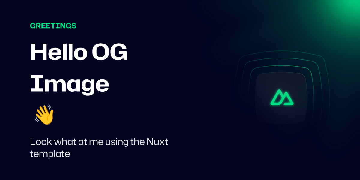
This will use the default template [NuxtSeo](/docs/og-image/guides/community-templates) with the [Takumi](/docs/og-image/renderers/takumi) renderer.
### 2. View your `og:image`
Visit the home page in your browser and open up the Nuxt DevTools (`Shift` + `Alt` + `D`).
Once you're in the Nuxt DevTools, you can navigate to the OG Image tab by opening the command palette (`Ctrl` + `K`) and typing `og`.
You should now see a preview of your OG Image.

## Part 2: Customizing NuxtSeo Template
Now that we can see our OG Image, we're going to customize it by modifying the props we pass to the `defineOgImage` composable.
Feel free to pass in any props you like, but for this example we're going to use the following:
```vue [pages/index.vue]
```
The playground has full HMR, so you should see the updated image immediately.

Congrats, you've set up and customized your first `og:image`!
Going further, we can even try using one of the other community templates available. For the full list, check out the `Community` tab within
Nuxt DevTools.
Community templates are for development only. Before deploying, eject them with `npx nuxt-og-image eject ` or create your own.
```vue [pages/index.vue]
```
You can see all the supported props on the [NuxtSeo Template](/docs/og-image/guides/community-templates) documentation.
It's also worth checking out the [defineOgImage API](/docs/og-image/api/define-og-image).
## Part 3: Creating Your Own Template
Using the community templates is a fun way to experiment with the OG Image template you want to use. However,
they will always be limited in what you can do with them.
For production builds, you **must** eject any community template you're using. The easiest way is with the CLI:
```bash
npx nuxt-og-image eject SimpleBlog
```
Or copy and paste the template manually from the `Community` tab in Nuxt DevTools or [GitHub](https://github.com/nuxt-modules/og-image/tree/main/src/runtime/app/components/Templates/Community).
### 1. Create your template component
We're going to start with the [SimpleBlog](https://github.com/nuxt-modules/og-image/blob/main/src/runtime/app/components/Templates/Community/SimpleBlog.satori.vue) template as a quick way to get started.
Let's copy this template into our project at `./components/OgImage/BlogPost.takumi.vue` and remove some of the boilerplate.
The module automatically registers any components you add to an OgImage folder as templates. The `.takumi` suffix tells the module which renderer to use - [Takumi](/docs/og-image/renderers/takumi) is the recommended renderer.
```vue [components/OgImage/BlogPost.takumi.vue]
{{ title }}
mycoolsite.com
```
### 2. Use the new template
Now that you have your template, you can use it for your home page.
```vue [pages/index.vue]
```
Check your Nuxt DevTools to see the new template in action.
You may notice that the Tailwind classes work, even if you're not using the Tailwind module.
Tailwind v4, [UnoCSS](https://unocss.dev), CSS variables, and Nuxt UI v3 colors are all supported by default. You can learn more in the [Styling](/docs/og-image/guides/styling) guide.
**The module processes CSS classes at build time.** Dynamic class names like `:class="[`border-${color}`]"` won't work because the generated class isn't in the stylesheet. Use static classes for Tailwind/UnoCSS, and `:style` bindings for dynamic values.
### 3. Customize your template
Now that you have your template, you can start customizing it.
Any props you pass to the `defineOgImage` composable will be available in the component.
With this in mind, let's add a new prop to change the border color: `borderColor`.
It's recommended to always provide default values for your props. This allows
you to preview the template when you're not passing any props.
Since the module processes CSS classes at build time, we use a `:style` binding for the dynamic border color
instead of a dynamic class name.
```vue [components/OgImage/BlogPost.takumi.vue]
{{ title }}
mycoolsite.com
```
Now let's customize the border to be a light green instead.
```vue [pages/index.vue]
```
Within the playground, you should now see the border color change to green.
**Test your OG images** - See how your images appear on social platforms with our [Social Share Debugger](/tools/social-share-debugger).
## Conclusion
Thanks for following along. You now have a basic understanding of how to use the module.
It's recommended to look through the rest of the documentation to get a full understanding of what's possible.
If you have any questions, reach out on [Discord](https://discord.gg/275MBUBvgP) or [GitHub](https://github.com/nuxt-modules/og-image).